Today, let’s make a quick return to our partnership with VALAB! What’s on the program?
A beautiful project that was important to us. A global overhaul. A sophisticated, thoughtful and intuitive interface. Deep research work. An inspiring and fun collaboration.
Nothing more, nothing less! Let’s go!
The Making of VALAB
Valab®, software for laboratory technicians
This scientific software designed and developed in Toulouse, sold throughout Europe, supports laboratory professionals on a daily basis. With the power to analyze records at an impressive speed thanks to incorporated artificial intelligence, the program is an important aid for biologists and scientists. So the company’s website had to be up to scratch. The VALAB team came to us for a complete overhaul. It was a very rich site with a customer zone which was very important.
Several major challenges were therefore to be addressed.

KPI workshops for intuitive interfaces
To be able to correctly identify the issues, the WS team met with the VALAB team for a little discussion on the KPI. These workshops are constructive and effective sessions, where everyone expresses their opinion. This allows you to organize ideas and clearly highlight everyone’s needs. The confrontation of desires and priorities makes it possible to identify issues corresponding to all, without making any compromise. We then understand all the needs of the different collaborators, specific, unique and varied.
Dialogue is very important to identify everyone’s wishes, to identify what is essential for one is not necessarily for the other. The exercise can be complex, but it is practical and essential for the continuation of the project.
It is up to us to identify how to combine what is said and to achieve a finished product suitable for all.
The site and its structure must respond and convince all stakeholders. It is not easy, but it is not impossible either!

User scenarios for a better structure
Where does the user come from? What is he or she looking for? Why is the user there? What is their profile? At WS, we never stop asking ourselves lots of questions!
To make the site easy to use, to make the sitemap logical for users, the WS team creates user scenarios. We put ourselves in the shoes of the user and try to understand their objectives. The interface must quickly succeed in giving him the information he is looking for, and finish convincing him to come back again. Thus, thanks to the user scenarios, we can guide the user, guide them intuitively, anticipate what he or she wants, before they even know it! Magic? No, just elaborate brainstorming and creativity!
A good user scenario makes it possible to establish a better structure. The guidance is then flexible, intuitive and meets the expectations and needs of the visitor. The site is clear and pleasant as much for the new user as for the regulars. The tree structure must succeed in convincing all audiences.
A before/after that speaks volumes!
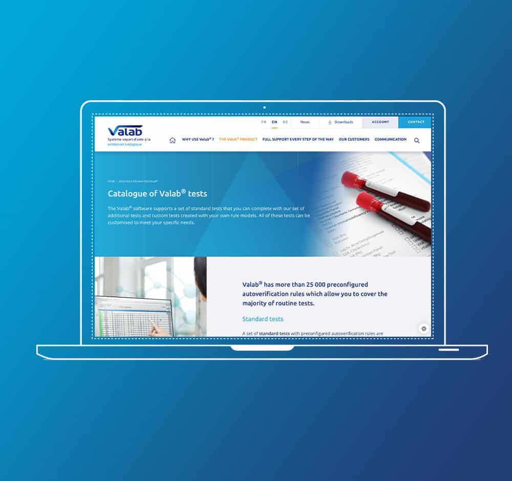
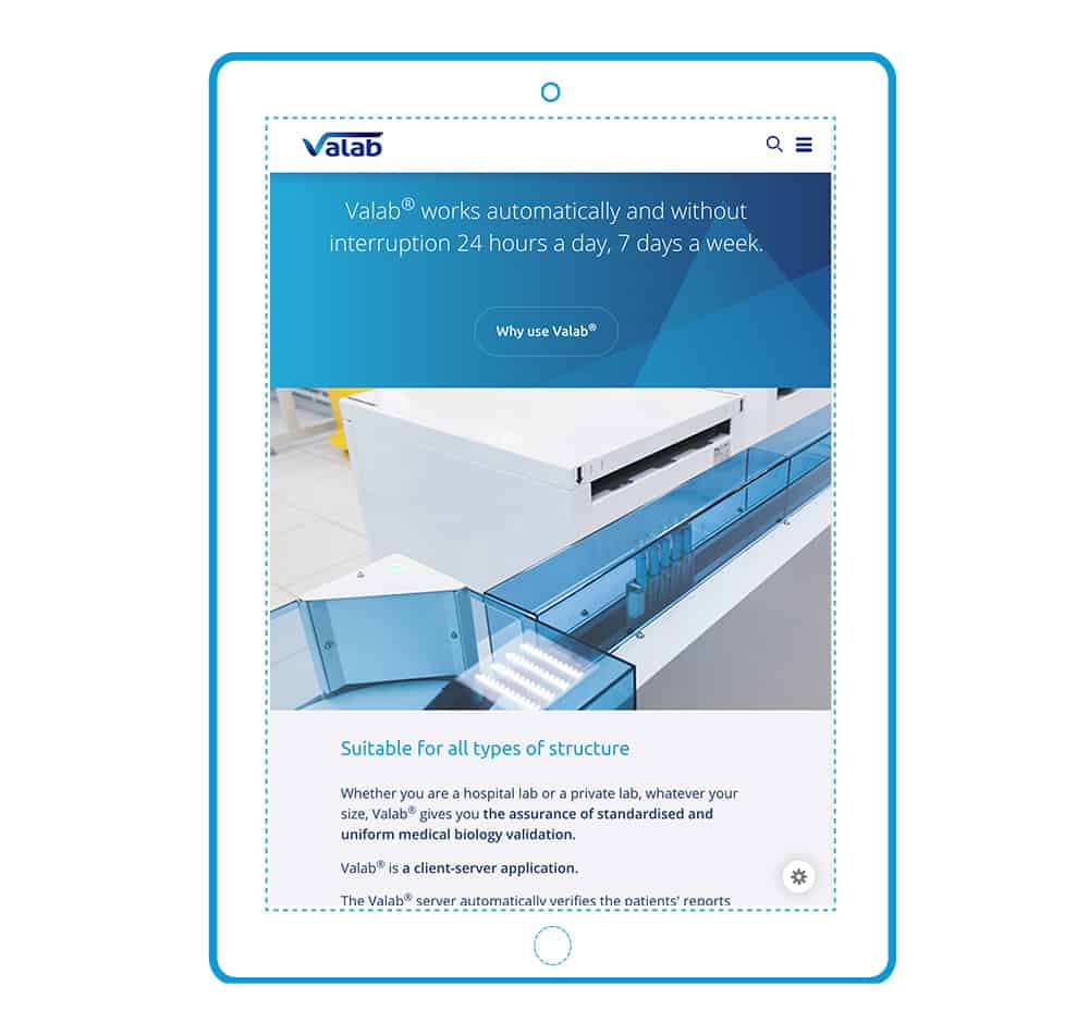
We all wanted, WS as much as VALAB, a site worthy of the software. At once powerful, contemporary and logical. For a total overhaul, a new design is not enough, nor is it a simple modernization. We have completely redesigned the site for a simplified user journey, intuitive and pleasant navigation. See for yourself.
Starting from a very rich and appreciated site, knowing how to appropriate it, understanding all the issues, getting the best out of it, going beyond it, transforming it. Who said it was easy? Besides the technical talents of the team, we especially know how to listen and adapt, these are always great qualities for understanding a project as a whole and promoting it!