You’ve read our little text about the digital project of Savoir-Faire Français and want to know more? You’ve come to the right place.
Here we’ll tell you about how this collaboration was born, what’s behind the website and why you can entrust us with your digital project …without any reservations whatsoever.
Making of French Renewable Energies: the French Expertise Abroad
Step one: a meeting
For this large-scale project, our team in Paris met the managers of Savoir-Faire Français (The French know-how for renewable energy). This trade association works to promote and demonstrate the value of renewable energies, with particular regard to industrial development in France. The know-how of our “blue-white-red” businesses is getting larger every year. The international reputation of French industry obviously depends upon a global communication strategy, one which targets audiences beyond the borders of France.
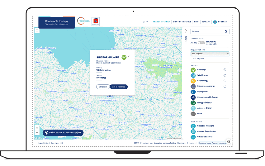
It was therefore necessary to create a digital presence for member companies with an interactive map that allows users to see these companies’ different achievements and other information with varying amounts of detail.
In order for it to function and provide relevant results, there were two “musts”:
- collecting data from member companies, who are the best-equipped to talk about themselves and highlight their work;
- envisioning an interface open to the world in order to spread this information on an international scale.
This information can be published using an easy-to-use, back-office tool to create easy-to-read, user-friendly content.
This large-scale project had to be economical. This constraint didn’t in any way prevent us from meeting the important aesthetic requirements of the site, which is imperative if we want to entice companies and international communities to work with French businesses and organizations.
Launched in 2017, the site now presents more than one hundred separate projects, and the association plans to double this figure over the next two years.

Step two: a concept
So, how did we get here?
First of all, WS successfully responded to the call for tender issued by the project of the Syndicat des Energies Renouvelables (Union of Renewable Energies). Their team was very receptive to our vision of the project and we met them in Paris to present the brief of our digital strategy.
Here’s a curious anecdote, one of their team members spotted our agency in Toulouse during a trip and then recognized our name on our rue Saint Lazare office in Paris! It’s a small world, after all.
In concrete terms, what did WS focus on for this website?
First and foremost, the interactive map. It’s essential because it’s not only a functional tool but it presents the capabilities and projects of the partners from dedicated pages.
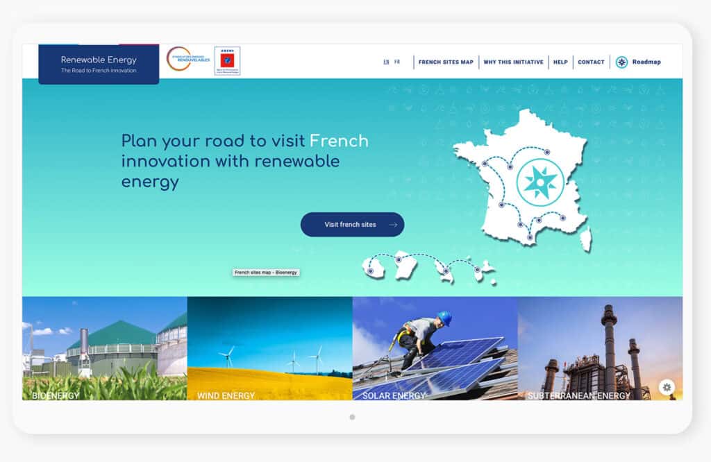
For the homepage we refined the aesthetics for the overall presentation of the field and the different sectors it involves. Because renewable energies affect a variety of sectors, it was important to clarify them in order to distinguish one from another and then to understand them.
For SEO reasons, it was also necessary to orient the positioning towards the key sectors of the field. The interface therefore offers calls-to-action to the user so that he or she is directed to the interactive map. Redirecting the user to this page is essential: it facilitates accessibility and finding information about companies and their projects.
Nevertheless the project posed the following problem: how to be responsive with a full-page map? WS web engineers undertook a big challenge in designing the interface so that it can keep search filters on the full-screen interactive map, whatever the support (desktop, tablet, smartphone, etc.) A real concern for the quality of the user experience. Say tomorrow 1000 companies want to take part in the project, it’s necessary that navigating and searching the site is just as agreeable and remains easy to use, whatever the support!
We logically opted for a map that uses clustering: it’s a system that allows users to group several records on the same numbered point of the map. The user can click on it and see the details. He or she is encouraged to discover a French company’s various achievements and to contact the company directly.
The visitor may arrive on the site by chance, be a returning visitor or even after having made a specific search for a provider with the solution to his or her needs. The site must therefore offer a response to different user pathways and requests.

The site must guide the user along their journey until they contact the company whose expertise meets their needs.
The purpose of this interface is to help companies or organizations seeking a large-scale renewable energy solution to find qualified providers on the site. It must be able to connect them in a simple and agreeable fashion. When we know and master various user pathways, we are better able to offer an adequate and effective design for the website.
This work also makes it possible to transform a passive Internet user into a proactive visitor: he or she searches, visits, gets in touch with a service provider and may even become a kind of ambassador by sharing the site with colleagues.
For the Syndicat des Energies Renouvelables the important thing is to convince visitors that member companies are capable of carrying out major projects.
Therein lies the complexity of this work surrounding user pathways: you have to know the different visitor profiles so as to adopt the right language.
So, to put it simply, we designed an interface that responds to different user profiles.
Step 3: our technique
The responsive aspect of the interface was at the heart of the challenge of this project. It was imperative that the user’s journey be as pleasant on a smartphone as on a desktop computer.
The search filters have been technically adapted to different screen resolutions to ensure optimal and enjoyable use for everyone, everywhere.
The front-end work is based on CSS files in combination with JavaScript to ensure the interface is responsive and offers smooth navigation.
The back office of this interface was optimized thanks to its integration with WS’s open-source CMS: Autumn CMS.
A lot of thought was given to the architecture of the platform. Our engineers created a multilevel system for the database:
- It focuses primarily on a central project;
- It then presents peripheral projects, based on a search of the map.
Adaptable and high-performance. This is the Savoir-Faire Français website. Awesome!