Rien Ne Va Plus
Rien Ne Va Plus: web-to-store
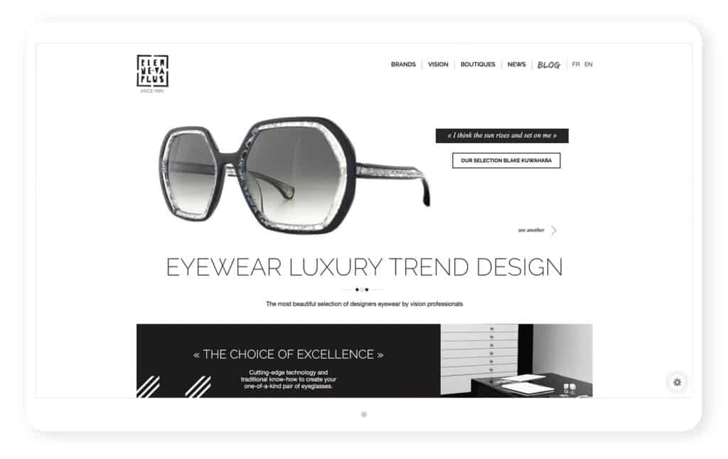
Rien Ne Va Plus, a French company that is not faint-hearted! It offers a selection of high-end eyewear and design-wear frames on its website and provides a fresh look at the world of optical fashion.
Its goal ? To attract a historically loyal public by enticing them to visit the optical centers which distribute the eyewear displayed in its online showcase.


A tailor-made visual identity
Our mission : to promote an original, avant-garde and luxurious image of the brands without blurring their identities.
The Rien Ne Va Plus website meticulously lists eyewear from several brands.
But with a hip interface, it preserves each brand’s personality while enveloping them in a cohesive graphic universe.
WS’ vision
In plain language, how did we meet the challenge? Well thanks to circular website design, the user is guided from A to Z: he or she looks up a designer or a product online, finds the boutique that sells it, goes to the shop…and buys it.
Our team thus created a web-to-store with a WS touch: easy to browse, ever-evolving and autonomous.
Perfect for a hip company like Rien Ne Va Plus. So chic !

Sweet words
“To offer a selection of state-of-the-art eyewear built from image and design is what the website is looking for.
We were drawn in by WS Interactive’s team approach during our meeting. The intermediate stages of creation, in particular the common reflection about our web strategy, our positioning, allowed us to put a form to the concept. Then the zoning work led us to think about the interface in terms of interaction with the user.
WS Interactive knew how to be a genuine creative force, how to understand our expectations and needs to interpret then in an even more creative way. They are a highly reactive and accessible team with whom we had great pleasure working.“
Team SMJP Diffusion