Toulouse Molecular and Functional Imaging Center
The web agency x CIMOF
New year, new optimized site!
And so begins the year 2024 for Toulouse’s CIMOF (Centre d’Imagerie Moléculaire et Fonctionnelle).
The web agency worked with CIMOF to co-construct a design and web solutions adapted to the current needs and future developments of the Clinique Pasteur Imaging Center! 🔎 Zoom in on this new benchmark in healthcare.
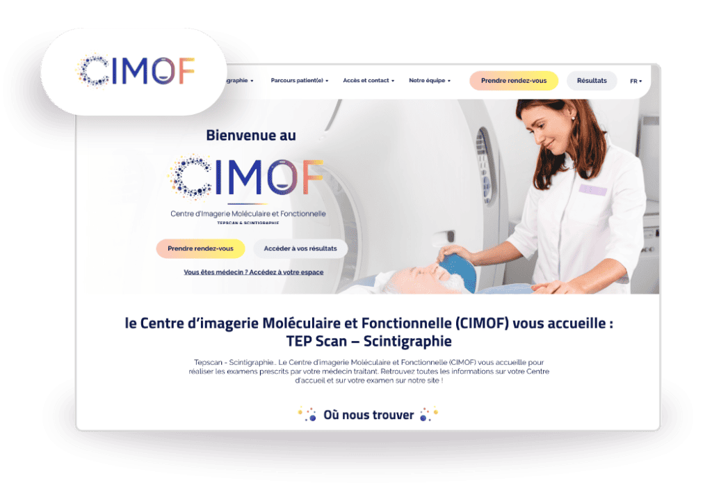
A new website for CIMOF Toulouse!
Based at the Pasteur Clinicthe Toulouse Molecular and Functional Imaging Center (CIMOF) offers all types of medical examinations related tomedical imaging and nuclear medicine.
In addition to Toulouse, their practice area extends from the Occitanie region to the Pyrénées-Atlantiques, thanks to several practice sites and a mobile expertise center.
Their mission is to support patients in the south-west of France in their care, thanks to their nuclear medicine examinations (PET Scanner or Scintigraphy).
Examinations with abbreviations and procedures that are sometimes obscure, or even intimidating, require us to guide our patients through these essential stages of their care.
CIMOF therefore needed a complete overhaul of its previous website (formerly named Tep-Toulouse), to simplify navigation and information retrieval for its users.
Customer journey, patient journey: Personalized support for a simplified experience
Our main objective: to facilitate access to key information and to the results of medical examinations carried out by the CIMOF… in a graphic universe that is very specific to nuclear medicine ;).
How do we meet this challenge?By developing tailor-made support, of course!
Just like CIMOF, your web agency is committed to providing meticulous support, based onlistening to and understanding the needs of its customers (and their customers – patients, by affinity).
Our watchwords: exchange and collaboration!
These values have accompanied us throughout the project… right from the graphic design phase, with the creation of the CIMOF’s digital graphic charter and logo.
A new corporate identity for the CIMOF in Toulouse
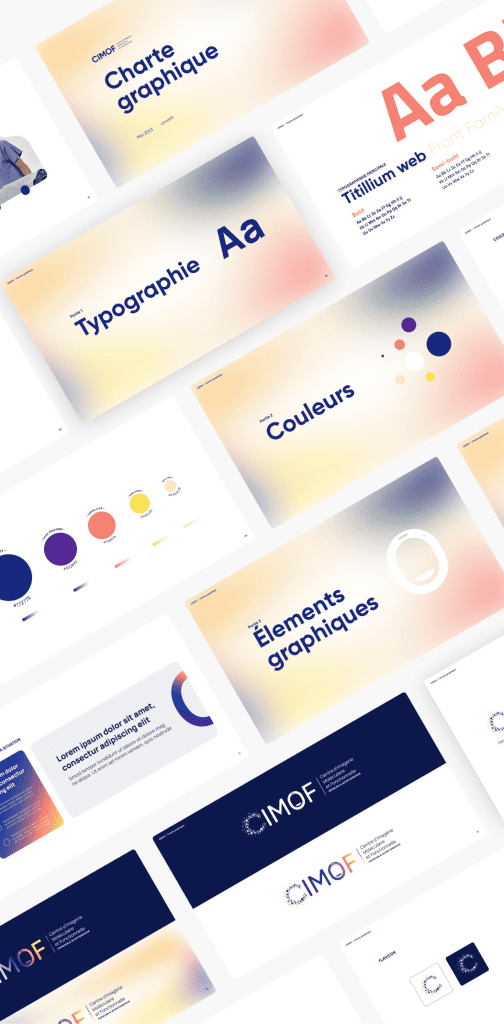
CIMOF’s idea? Use the color palette of PET Scan results (blue, yellow, orange, violet) to create a unique graphic identity representative of their core business.
On the face of it, a complex graphic challenge, hard to imagine. But dialogue, advice and consultation were the key to unlocking our imagination!
The result: a distinctive graphic universe, rich in color and gradation… without losing legibility, thanks to its white backgrounds and solid colors to preserve accessibility!
The CIMOF’s graphic universe is also expressed in its new logo, the gradation of colors and the cloud of dots echoing the characteristic elements of the world of nuclear medicine.
And on the site, this very special graphic universe is reinforced by visuals from the health sector, to illustrate the examinations presented!
To sum up our web support for CIMOF? Simplicity and accessibility, for an optimized experience! This Leitmotiv guided the UX/UI design of the website we developed for the CIMOF team. 🤝
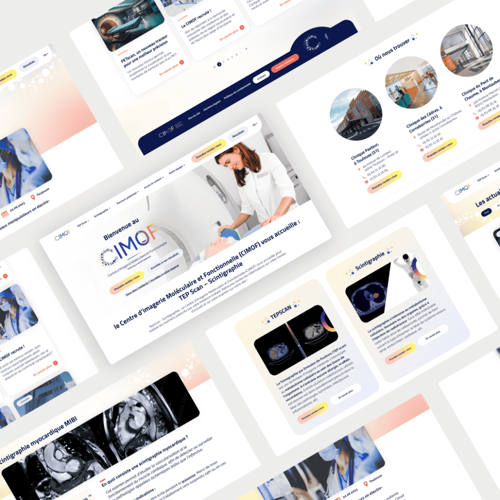
A website that’s easy to access and manage
Simplify, simplify, simplify, that’s been our mantra throughout this project.
A simplification for patient-users, but not only! Administrators also benefit from an intuitive, easy-to-understand, modular interface. Zoom in on this winning combo!
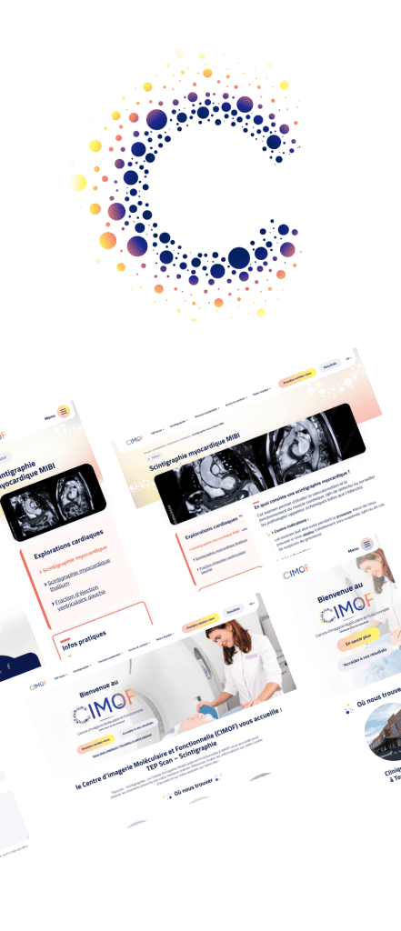
UX/UI design & Information accessibility for users/patients
Our guiding principle throughout the project was to simplify information and make it easier to understand for patients, CIMOF’s core target.
Simplification through site UX/UI design! Between listening, dialogue and advice, our UX reflection led us to the creation of personalized blocks/styles, to guide and punctuate the reading-navigation of CIMOF patients:
- Contact details” block to make it easier to find and contact examination centers .
- Practical information” block, always positioned in the same place to create a reading reflex, and highlighted by its red outline. It’s impossible to miss the essential information on each exam!
- Patient path” block, forming a dotted path to guide them through each stage of their examination.
- FAQ” block to answer frequently asked questions about each exam.
These blocks are positioned in the site’s Examination sheets which, as their name suggests, decipher the steps and prerequisites for each examination (Tep Scan, Scintigraphy), classified by the body region concerned.
The “Centre d’accueil” sheets list the CIMOF examination centers. Presented on the Home Page, they are also all automatically listed in the “Where to find us” section of the site, to simplify patient search for an examination center.
And how can you design a healthcare website without consideringaccessibility issues?
While awaiting the RGAA version, v.1 of the CIMOF website has been designed with the main principles of the RGAA in mind.digital accessibility design sober and legible thanks to its white background (contrast, contrast and contrast!), combined with the keyboard navigation and text transcription databases (alt tags, and the ability to upload transcript files for multimedia elements).
The basis is there, now it’s just a question of making it more accessible ;).
And to complete theaccess to site informationlet’s not forget the important language barrier! Always with a view to accessibility and simplification (let’s not forget our mantra for this project: simplify, simplify, simplify)In addition translate the site into several languages French, English, Spanish and even Arabic when content is translated. The objective? Make it easier for everyone to understand the information, especially the examination conditions, important information that deserves to be read in one’s mother tongue.
A simple, intuitive back office for administrators
And for administrators, the same mantra applies again and again: simplify.
At WS, we’re committed to delivering sites that are easy to manage .
The CIMOF Back Office is a good example: simple and sober, so that everyone can easily understand it. With the proposedinitiation by your Toulouse web agency, and related video tutorials, you’ll have all the keys you need to get your site up and running!
The result:a simple and intuitive Back Office (BO), with adapted and duplicable layouts, to create your own pages without wasting time!
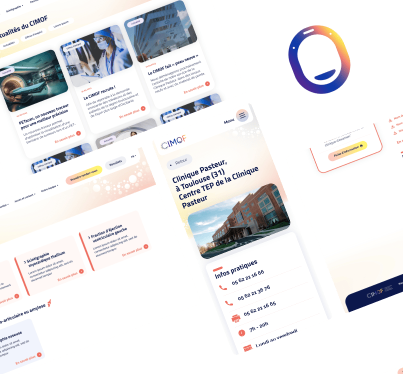
In a nutshell? A complete redesign to present and represent the CIMOF. Presenting the expertise of its teams and the progress of each examination… while representing their world, in the colors of nuclear medicine.
A complete web project that gave life to a simple, practical website, while imagining a modern, colorful design. And a project site ready to evolve, to better meet the challenges of today and tomorrow!
In short, a truly comprehensive project that your web agency is proud to have carried out for the CIMOF teams!
Are you ready to launch your project?
If, like CIMOF, you want to redesign your website, don’t hesitate to contact us! We’re ready to support you.
Contact us to discuss! 😉